Design Process: WIZZYWIG
May 16, 2012
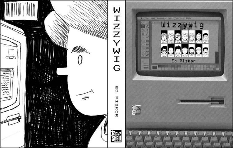
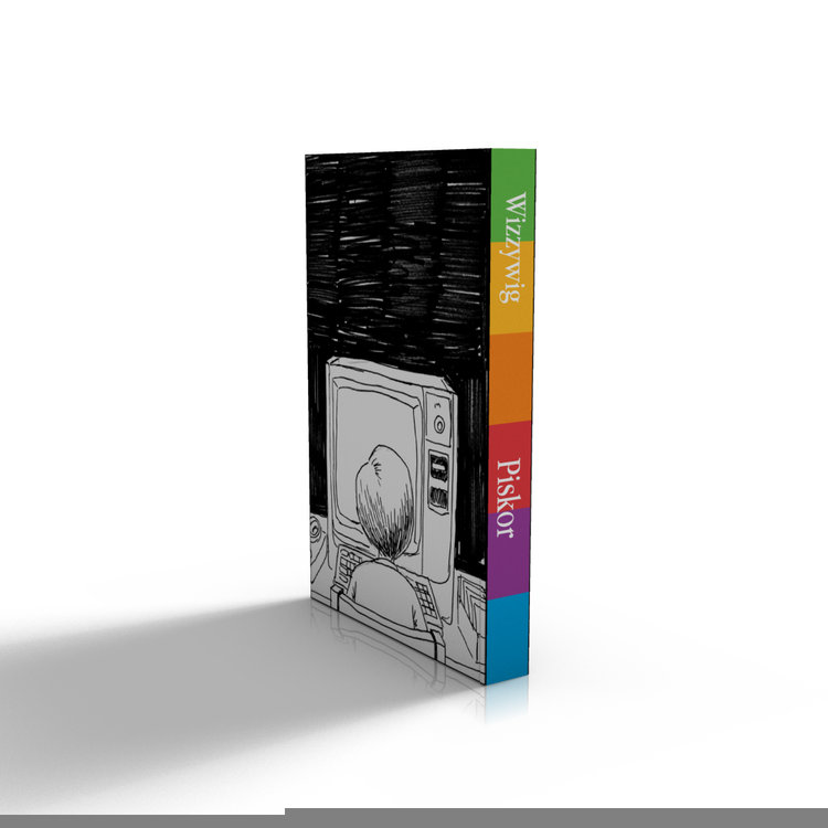
We started with about eight thumbnails from Ed. All of them have different variations of the main character, Kevin, in different situations. The one that we all liked the most was the one with the Macintosh on the cover.
I like going in different directions, trying to discover colors textures and other design elements. Here are some early variations cover that I came up with. Most were rejected, but it's when we got to the spine or we all agreed it was an neat idea. It's funny being a contrary designer, because you end up finding things that later work on later projects (the rough "used" idea I later used with Jeff Lemire's THE UNDERWATER WELDER, and some of the type treatments I'm using on a TOP SECRET PROJECT.


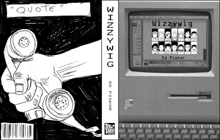
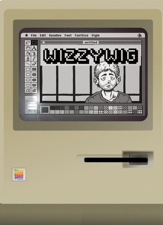
Matt Kindt did a variation using photographs, and we liked parts of the composition when Ed integrated the drawn version. Here's Matt's version:
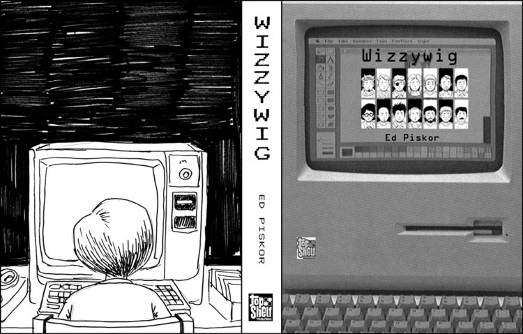
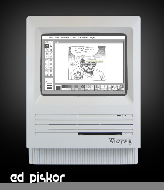
I also did a variation with photographs using the MacPaint window, as well as one that looked like old computer manuals from my childhood (see above). I usually like mocking out the book in 3-D program so I can get a sense of the whole book. Ed liked the rainbow spine, and also wanted to use a green/interlace motif. He later used this on the back cover.
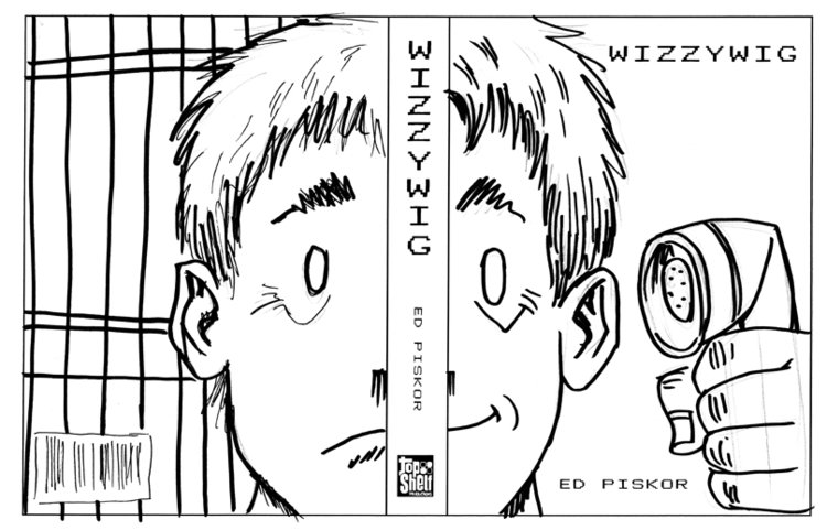
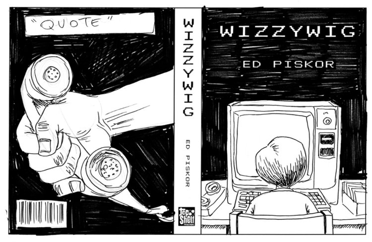
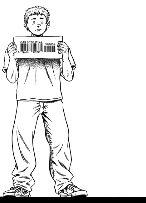
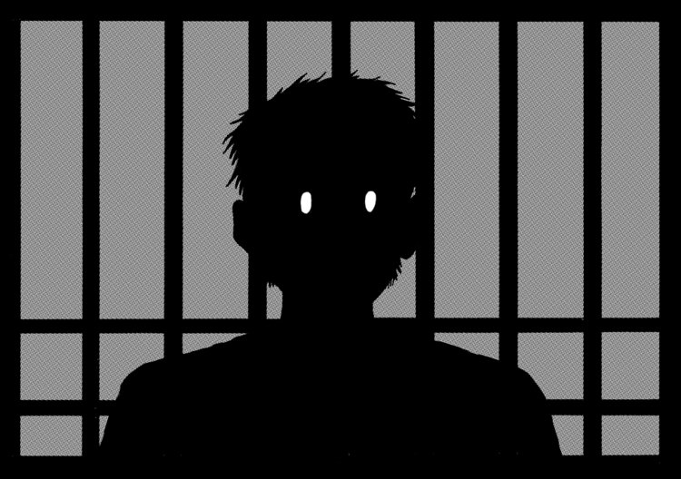
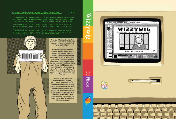
Brett and I wanted the main character to be on the back cover holding the barcode like he's posing for a mug shot. So Ed came up with this:
While Brett, Ed, and I were thinking about the back cover, Ed brought up designing the end papers.
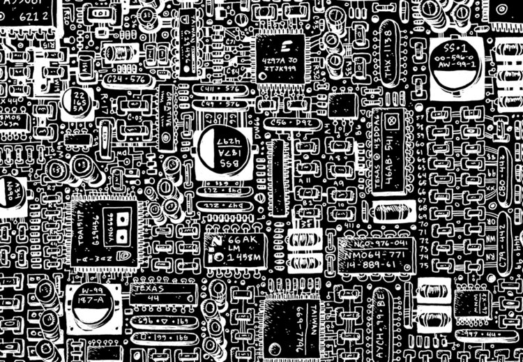
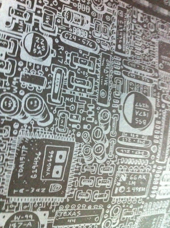
Brett and I thought about the endpapers as being inside of a computer, as though you were opening a computer when you opened the book. I thought it would be interesting to have schematics or a hand-drawn version of a motherboard that was extremely detailed One of the endpapers Ed provided was inverted. This gave me the idea that it would be interesting to print white ink on black paper, reminding me of blueprints. There was a concern that the white ink wouldn't look right on black paper, so we asked the printer to provide samples. The white ink actually made the paper look almost pearlescent.
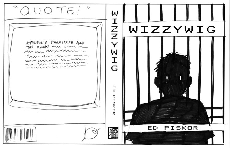
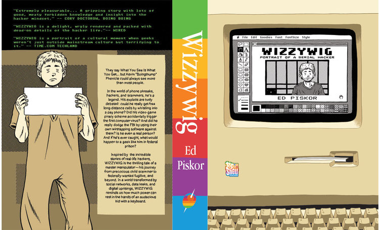
Ed and I came up with a rough idea of the entire cover spread, with updates on the back that he was noodling on. I starting building variations with Kevin standing in front of the backcover "screen" were the blurbs would go.
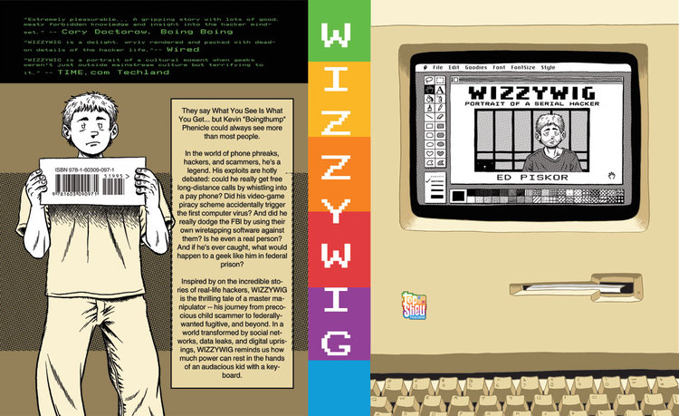
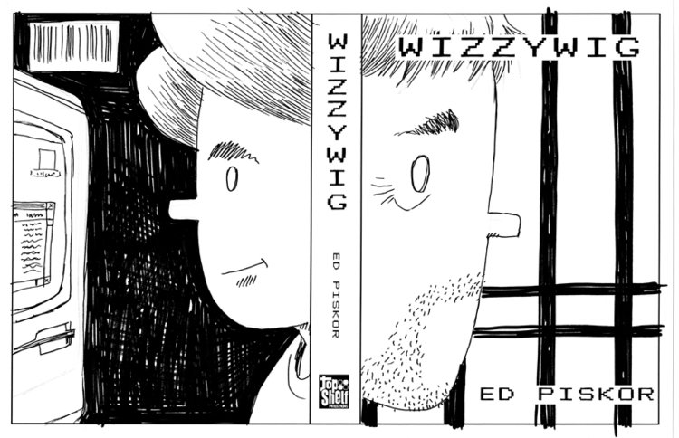
Ed and I tightened the back cover. I refined the spine and his design of the back, including varying the placement of Kevin, creating and sharpening the olive logo, and moving things around.
This was the tight rough after the art came to me from Ed. A lot of what I do is take a design I worked on (usually with an author) and prepare it for print—sort of like taking a wrench and tightening the design.
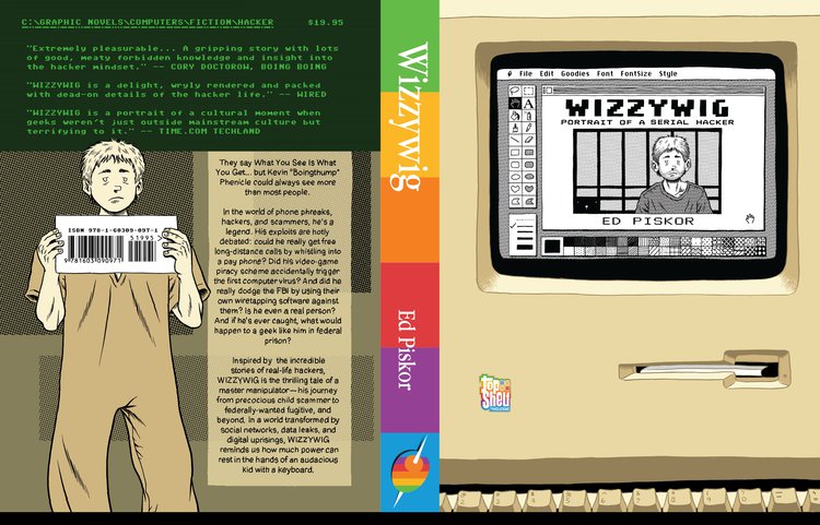
I then worked with Ed to nudge the backcover, tighten up the spine (again!), and to note gloss and deboss. Ed and I were simpatico with what we both felt were important areas to gloss and deboss, and I added a slight screen glare and interlacing to the back cover. Then off to press!
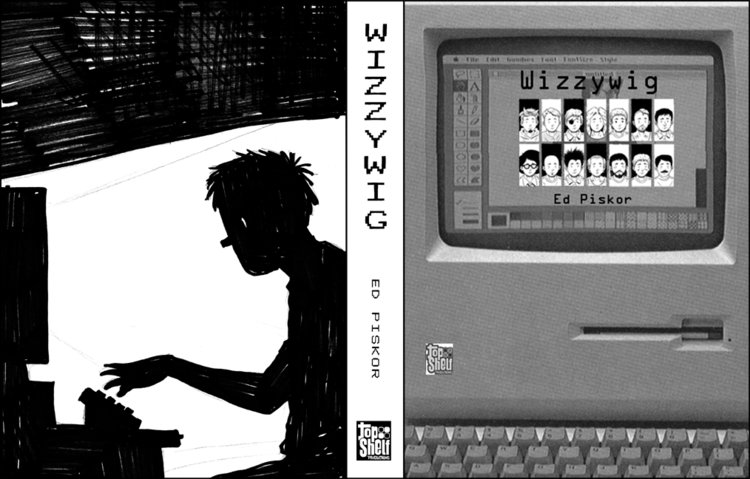
You'll notice on the version below that it seems empty around the outsides—this is because I have to design books that wrap around the boards of the book and tuck under the endpapers. You'll see a mirror image on the keyboards that will fool your eye—it's something you'll never see, but like Steve Jobs' father said, we know it's there.
And now it's off to comic book shops, bookstores, ebooks, etc.
Cheers!
—Chris Ross